Creating WPF Metro style applications with MahApps.Metro
When I started my pet project with WPF I didn't want to create my application with default styles. As I am new to WPF and Xaml I also had lot to learn and styling of apps was not my priority, but I still wanted stylish design for my application.
For Web development there are several UI frameworks like Bootstrap or Zurb Foundation. So I thought that there should be some for WPF too and found MahApps.Metro. Here is a quick tutorial how to begin with it.
First of all install MahApps.Metro NuGet package into your WPF application project.
Install-Package MahApps.Metro
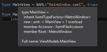
Next open MainWindow.xaml file, change Window tag to Controls:MetroWindow and add xmlns:Controls attribute with Controls namespace for MahApps.Metro window.
<Controls:MetroWindow
    xmlns="http://schemas.microsoft.com/winfx/2006/xaml/presentation"
    xmlns:x="http://schemas.microsoft.com/winfx/2006/xaml"
    xmlns:fsx="clr-namespace:FsXaml;assembly=FsXaml.Wpf"
    xmlns:fsxaml="http://github.com/fsprojects/FsXaml"
    xmlns:Controls="clr-namespace:MahApps.Metro.Controls;assembly=MahApps.Metro">
If you want to use resources or bind data context, now you should use Controls:MetroWindow's appropriate tag.
    <Controls:MetroWindow.Resources>
        <ResourceDictionary>
            <local:SomeResource x:Key="ResourceKey"/>
        </ResourceDictionary>
    </Controls:MetroWindow.Resources>
    <Controls:MetroWindow.DataContext>
        <Binding Source="{StaticResource SomeResource}" Path="ThePath" />
    </Controls:MetroWindow.DataContext>
If you are using FsXaml, then new window type should be automatically detected.
If you run your application now it will look awful :) Last step to define style resources in App.xaml. After that application will be ready to run.
<Application.Resources>
  <ResourceDictionary>
    <ResourceDictionary.MergedDictionaries>
      <ResourceDictionary
        Source="pack://application:,,,/MahApps.Metro;component/Styles/Controls.xaml" />
      <ResourceDictionary
        Source="pack://application:,,,/MahApps.Metro;component/Styles/Fonts.xaml" />
      <ResourceDictionary
        Source="pack://application:,,,/MahApps.Metro;component/Styles/Colors.xaml" />
      <ResourceDictionary
        Source="pack://application:,,,/MahApps.Metro;component/Styles/Accents/Blue.xaml" />
      <ResourceDictionary
        Source="pack://application:,,,/MahApps.Metro;component/Styles/Accents/BaseLight.xaml" />
    </ResourceDictionary.MergedDictionaries>
  </ResourceDictionary>
</Application.Resources>
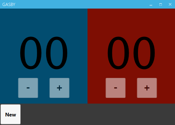
Default styles for application are light blue. Here is my application with this style applied.
To change styles you have to change last two resources. First is for color and second for light (BaseLight.xaml) or dark (BaseDark.xaml) base. There are available quite a lot of colors: Amber, BaseDark, BaseLight, Blue, Brown, Cobalt, Crimson, Cyan, Emerald, Green, Indigo, Lime, Magenta, Mauve, Olive, Orange, Pink, Purple, Red, Sienna, Steel, Taupe, Teal, Violet, Yellow. Actual list of all colors can be found here.
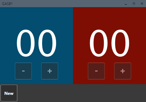
Below is my application with dark steel style.
For more information on how to start check introduction tutorial.
MahApps.Metro also has different styles for different controls and it can customize your titlebar.